The problem
People couldn’t find what they needed on the university website, the one place the whole university communicated. In my survey of 174 people, 54% said navigation was their biggest problem: they couldn’t find the information they needed.

The problem
People couldn’t find what they needed on the university website, the one place the whole university communicated. In my survey of 174 people, 54% said navigation was their biggest problem: they couldn’t find the information they needed.
What I did
Audited the site, surveyed 174 students, faculty and staff, then restructured it around user groups and tasks: an “Info for” layer, Admissions and Academics up front, and a joined-up academics journey.
What changed
Exams, events and notices move from the footer (88% down the page) to one click from the top, and every programme now sits inside its department.
Status
A self-initiated concept, not built. I tested the prototype with 7 students: 6 found course information easily.
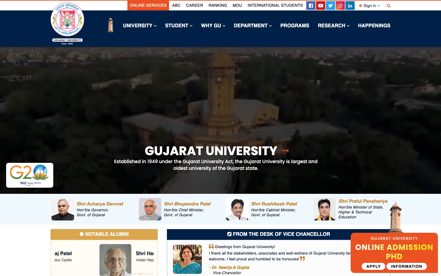
Drag to compare the homepage in December 2024 with the redesign.
University websites are supposed to make life easier. You go there to check an exam date, read about a course, or work out how to apply.
In December 2024 I audited Gujarat University’s site with one question: where does someone go for the things they need most?
The menus at the top mapped the university’s offices and departments, not what people came to do.
Why this mattered
The website was the only place the whole university communicated.
Notices, exam forms, results, events and admissions all went out through it. So it mattered as much to the students already enrolled, who checked it every week, as to the prospective students deciding whether to apply.
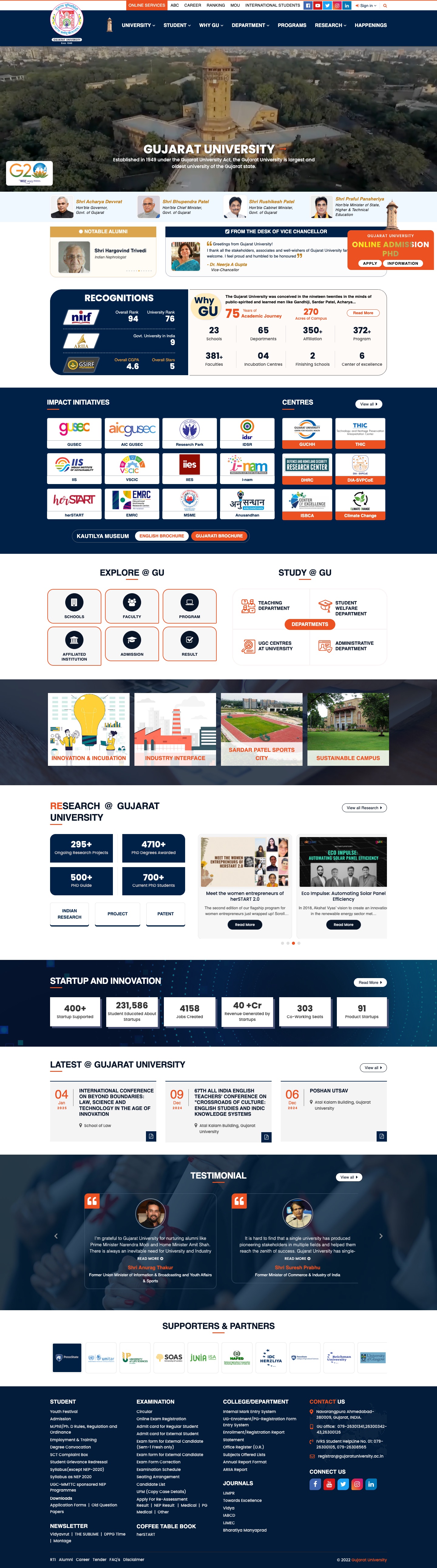
How far down the homepage you had to scroll for everyday tasks
The top, what you see first
Menus, a campus video, ministers and alumni. No links to exams, results or the syllabus.
Two-thirds of the way down
Upcoming events (“Latest @ GU”).
The footer, 88% of the way down
Every exam, result, syllabus, circular and admission link. Regular users scrolled all the way here, every time.
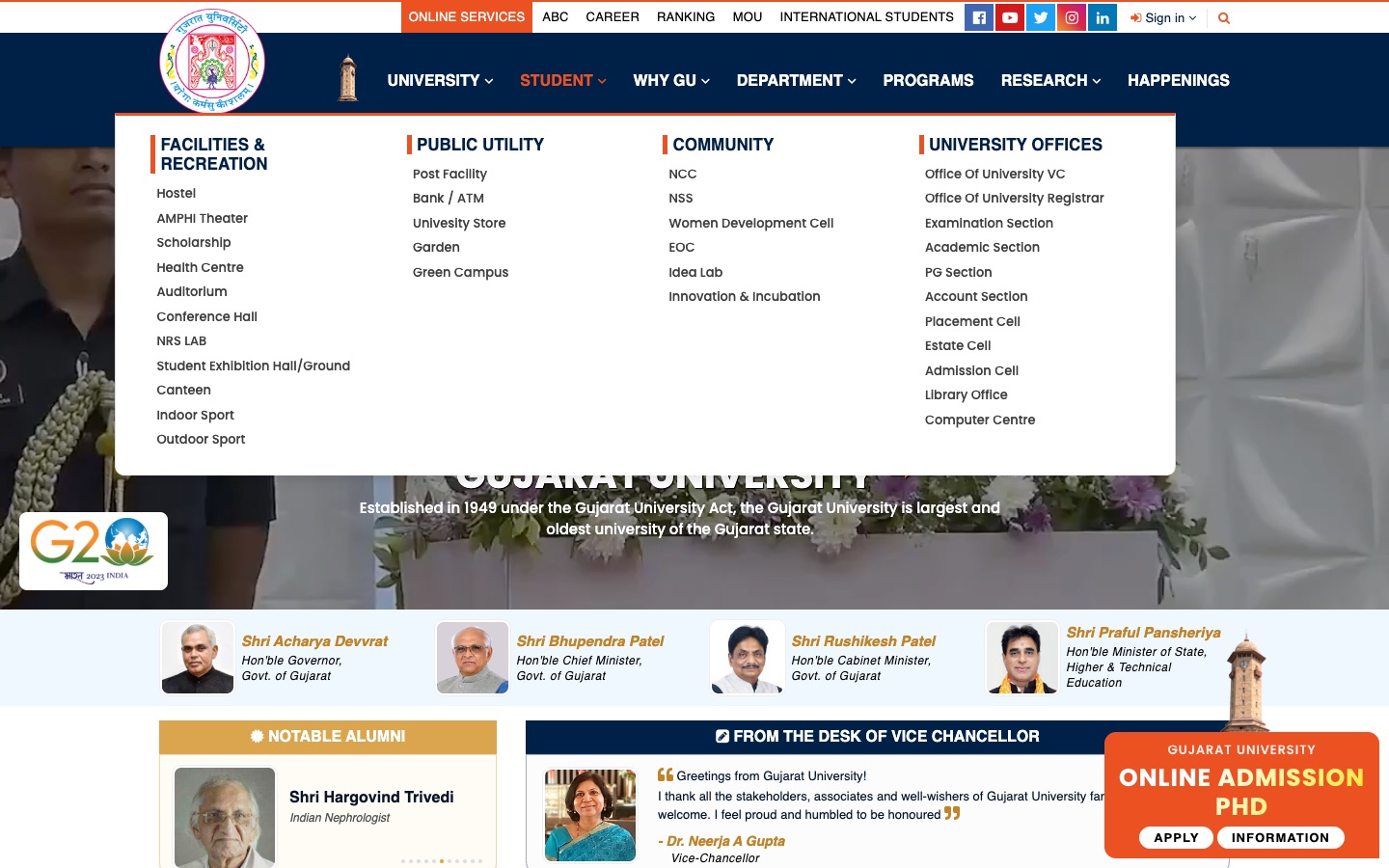
Left: what students needed, at the bottom of every page. Right: what the “Student” menu offered at the top.
Site audit, Wayback Machine, 17 Dec 2024
An audit shows what’s on the page, not what people struggle with. So I surveyed students, faculty and staff with a 12-question Google Form.
Most respondents were students (79%), and most were regulars: 57% used the site every week or every day.
The answer options were mine, so I followed up with personal interviews to understand the reasons behind the numbers.
said navigation was their biggest challenge: they couldn’t find the information they needed. That’s three times any other answer.
Survey, biggest challenge, n = 174
come for course and programme details, more than for anything else.
Survey, what they look for (multi-select), n = 174
asked for better search. In interviews the reason was clear: the menus didn’t lead people to what they needed.
Survey, features wanted, n = 174; reason from interviews
Survey results, n = 174. Ease of finding information averaged 3.0 out of 5; 38% rated it 1 or 2.
In their words: answers to the open question
Footer info to be more prominent.
Administrative staff, visits daily
There should be proper bifurcation of menu for students and Administrative staff.
Student, visits daily
…the information regarding our courses are mixed up with other courses which again makes it difficult to find information…
Student, visits daily
Verbatim survey answers. Each one maps to a decision in chapter 05.
was the average score for how easy it was to find information. For a site most people use every week, average isn’t good enough.
wanted syllabus to be easier to reach. On the old homepage it was a footer link, 88% of the way down.
A cleaner interface would make the site look better. It wouldn’t make information any easier to find.
The audit and the survey pointed at one root problem: information was organised around the university, not around the people using it.
The core problem
Finding the right information
Exams, results and syllabus sat in the footer, and the Student menu listed hostels and offices. 54% said navigation was their biggest challenge: they couldn’t find the information they needed.
Organise information around what people come to do, put the most-used things closest to the top, and give each user group its own way in.
Three principles that shaped every decision after this
Organise by task, not by org chart
Menus mirrored offices and departments. People arrive with tasks: check an exam date, read about a course, apply.
Seen inAcademics and Admissions in the main menu, Life@GU
Every group gets its own way in
Students, faculty, alumni and international students each get a page of what they use every week, instead of digging through the footer.
Seen inThe “Info for” bar
One connected journey
Course pages sat on a separate journey, cut off from the main menu. Now Academics leads from department to programme to course in one path.
Seen inThe department and course pages
The problem wasn’t how the site looked but how its information was organised. Three principles carried that into the design.
The old menus were a map of the university: its offices, cells and departments. I redrew it as a map of what people come to do.
I counted every link in the old menus, regrouped the content into eight sections, and added an audience layer, “Info for”, above them.
Key discovery
come for course and programme details
Academicsnot in the main menu
come for admission information
Admissionsnot in the main menu
Survey, n = 174; menu audit of the archived homepage, 17 Dec 2024
The key solution
Different audiences, one site.
The website was the only place the whole university communicated. Current students come back every week; prospective students are deciding whether to apply. Instead of one menu trying to serve everyone, each audience gets its own way in.
An “Info for” bar above the main menu
Exams, results, notices and events, one click from any page. Before, they sat in the footer, 88% of the way down.
Academics and Admissions in the main menu
Course details (85%) and admission information (66%), the two things people came for most, now sit up front, with “Why GU?” alongside.
Items from the archived December 2024 menus and footer (Wayback Machine, 17 Dec 2024). A selection is shown; the old menus held about 190 links.
Prospective students
“Admission Cell”, under Student › Offices
Admissions, top level
Course information
85 department links
Academics › schools › departments › programmes
Campus life
Facilities under Student, campus life under “Explore @ GU”
Life@GU, one section
Every major change answers a specific problem from the audit or the survey. Here they are in the order a visitor meets them.
Each decision shows the evidence, the page before (December 2024) and the page after.
A second navigation bar above the main menu: Info for Students, Faculties, Alumni and International Students. Each opens a page of what that group uses week to week: upcoming events, examinations, announcements.
What users told me
57% use the site every week or every day, and 61% come for events and announcements.
“Footer info to be more prominent.”
Administrative staff, visits daily
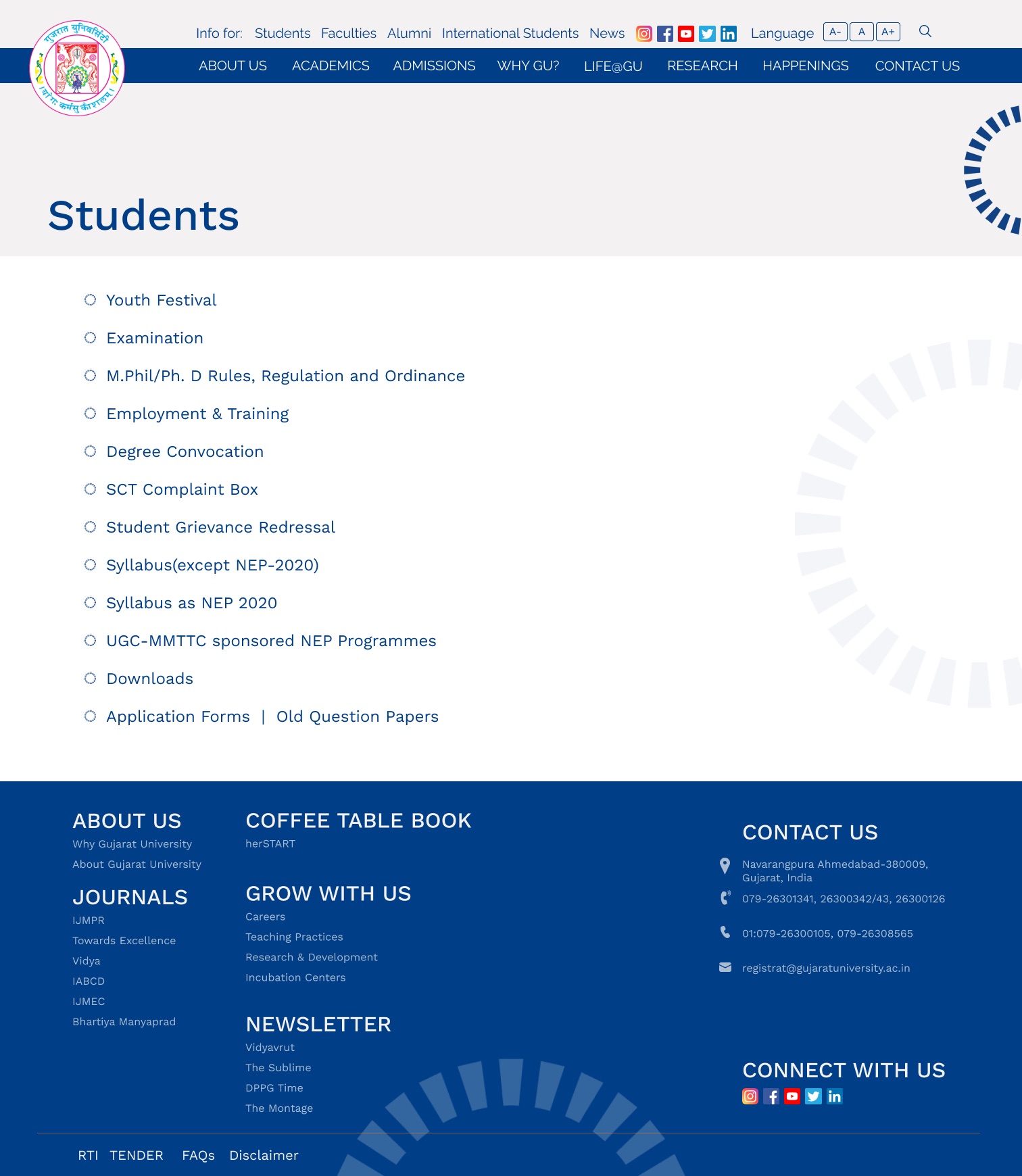
Exams, results, circulars and syllabus lived in the footer, 88% of the way down. Regular users scrolled here, some two or three times a day.
Info for: Students opens one page of student essentials: examination, syllabus, downloads, grievance redressal.
Drag to compare the page in December 2024 with the redesign.
Admissions and Academics become top-level menu items. Admissions gathers how to apply, important dates, fees, scholarships and hostel costs in one place.
What users told me
66% look for admission information, and 85% for course details. Neither had a place in the old menu.
“A regular and Consistent admission portal that gives Year-wise information on merit and all information…”
Faculty, visits daily
The old menu: University, Student, Why GU, Department, Programs, Research, Happenings. No Admissions; “Admission Cell” was listed under Student › Offices.
Academics and Admissions in the main menu. Admissions holds how to apply, important dates, fees, scholarships and hostel costs.
Drag to compare the page in December 2024 with the redesign.
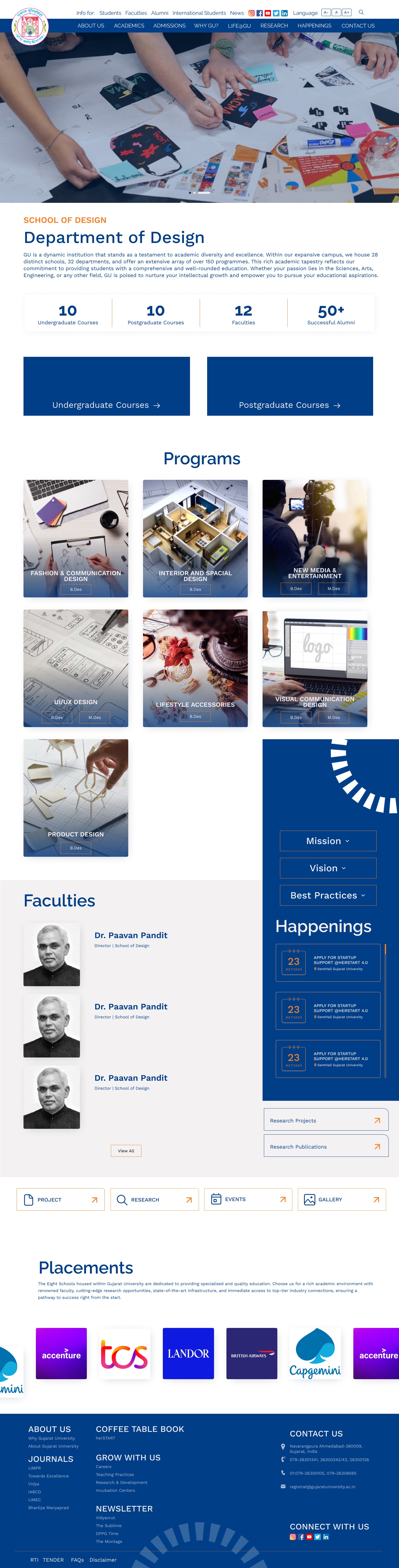
The department page was rebuilt around the question students bring to it, “what can I study here?”: course counts, undergraduate and postgraduate entry points, then every programme as a card.
What users told me
85% come to the site for course and programme details, more than for anything else.
“We are students and we expect about syllabus or important study material instead of history of counsellor and teacher profiles”
Student, visits weekly
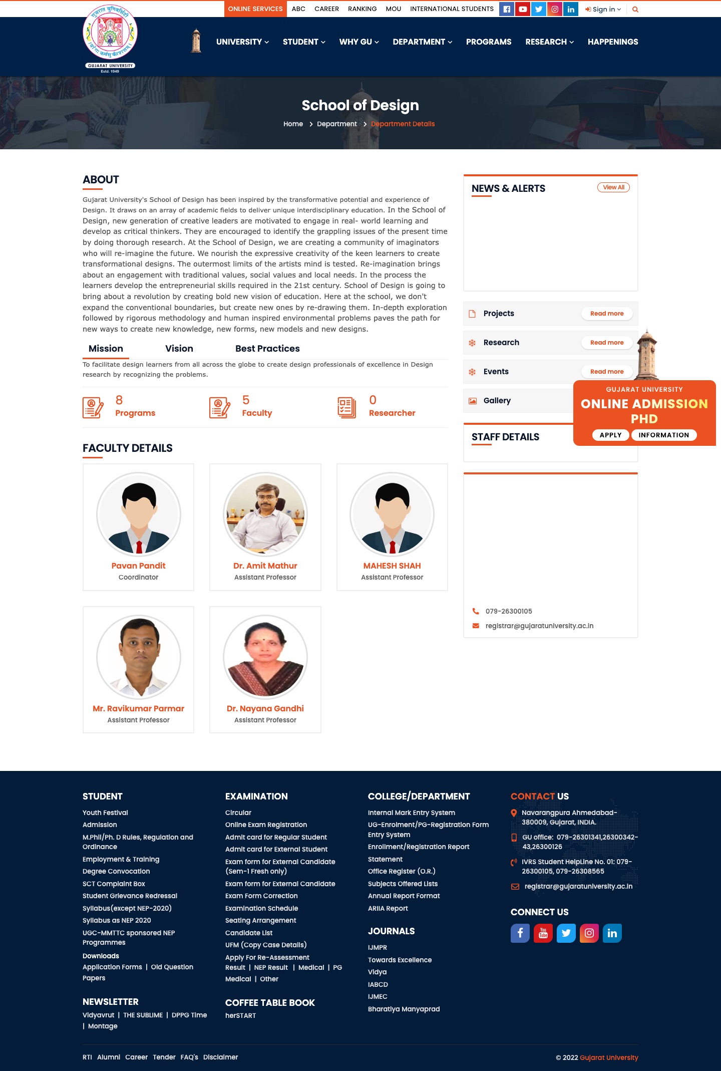
School of Design, Dec 2024: a wall of text and a counter reading “8 Programs” that links to none of them.
Department of Design: counts, UG and PG entry points, then each programme as a card linking to its course page.
Drag to compare the page in December 2024 with the redesign.
Course pages used to sit on their own, reached from a flat Programs list and unlinked from their department. Now they live inside the academics journey: Academics, then school, department, programme.
What users told me
72% asked for a syllabus section, and 85% come for course details.
“make it simple and easy to navigate and easy to find details about your course”
Student, visits rarely
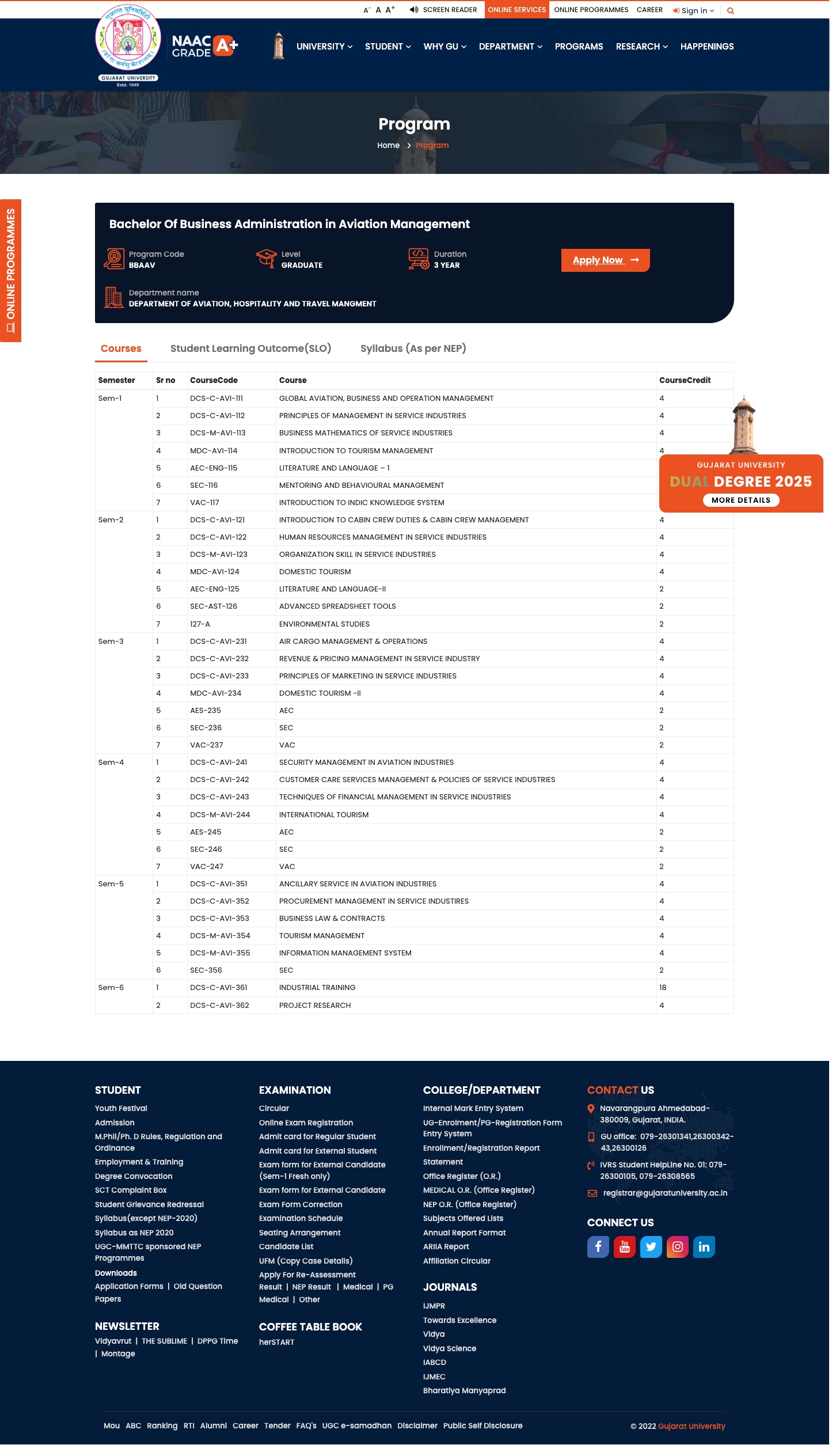
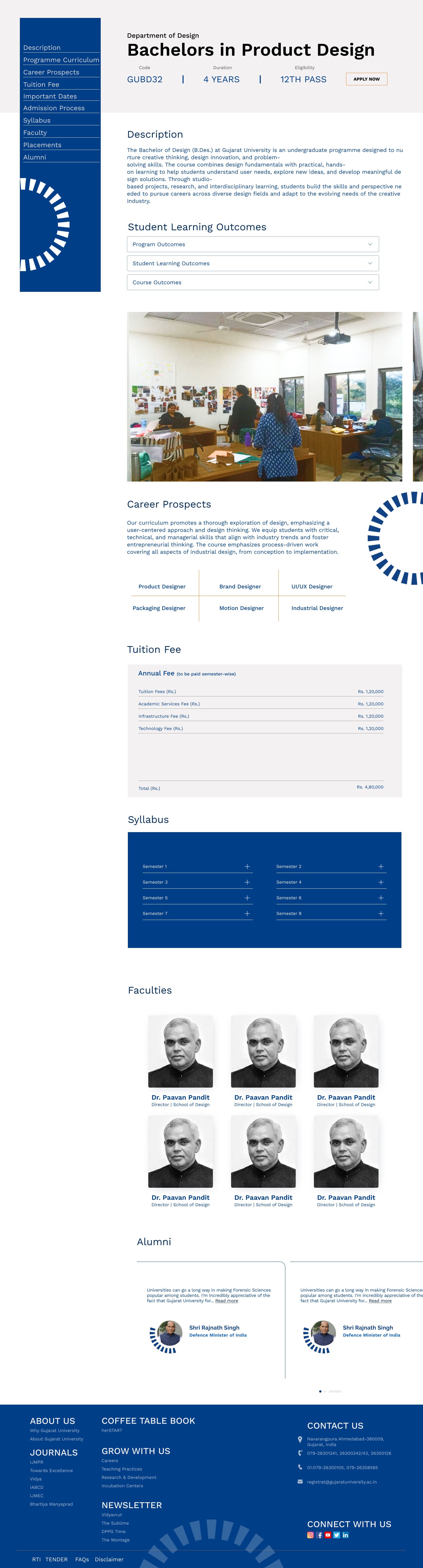
A course page reached only from a flat Programs list. Its breadcrumb reads “Home › Program”, with no link back to its department. (Captured from the live site; the page is unchanged.)
The course page sits under its department, with code, duration, delivery and eligibility up top, and a section index for curriculum, fees, dates and syllabus.
Drag to compare the page in December 2024 with the redesign.
Sports, facilities, community, gallery, alumni and the magazines were spread across the Student menu, an “Explore @ GU” strip, an alumni section and the footer. Life@GU brings them under one tab.
What users told me
Campus-life content was scattered across the site. It now lives in one section.
“Information should be available in one place as per the sections.”
Faculty, visits weekly
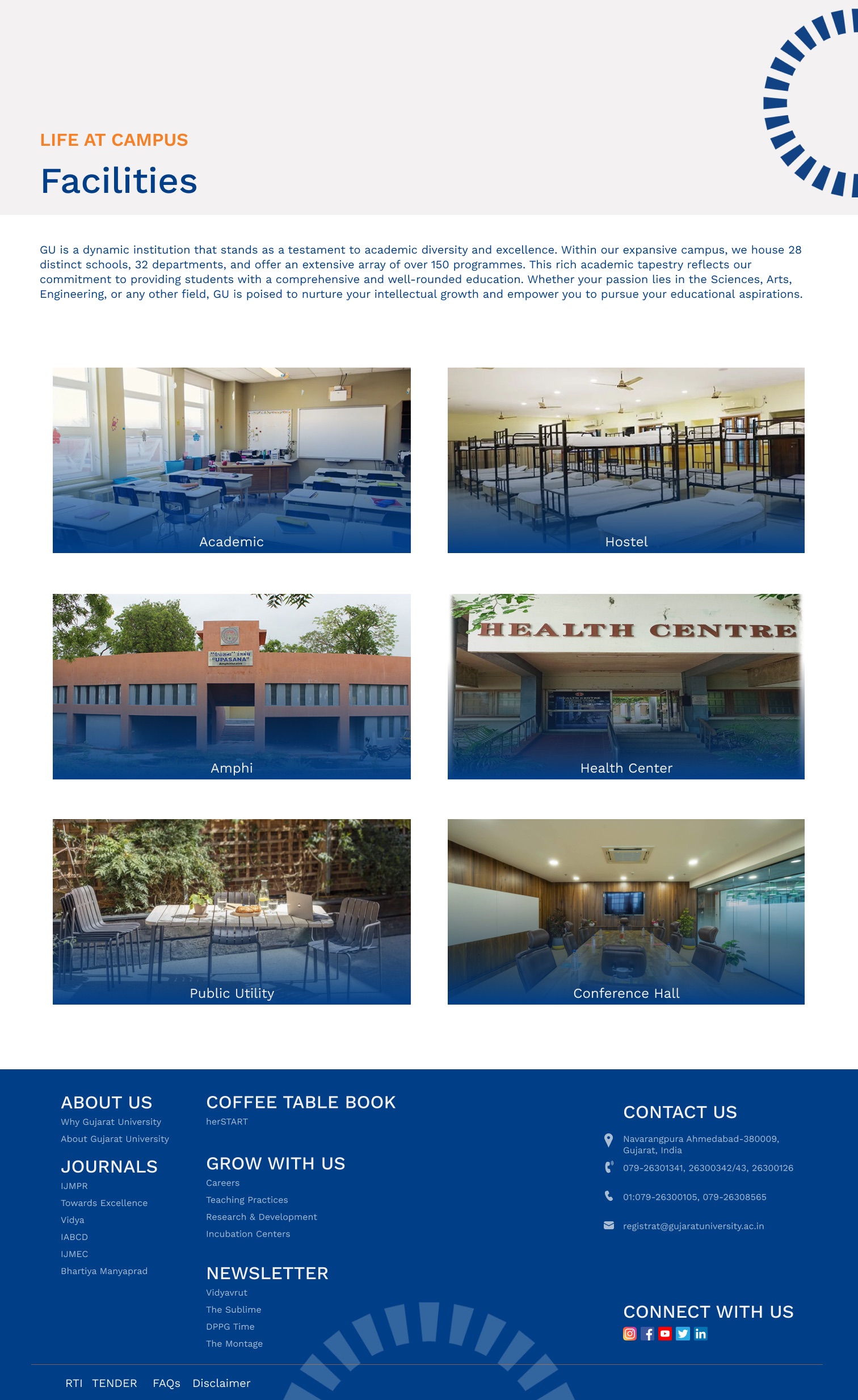
Campus life, Dec 2024: facilities under the Student menu, more tiles under “Explore @ GU” halfway down the homepage, alumni in the footer.
Life@GU: facilities, sports, community, gallery and alumni under one tab, each with its own page.
Drag to compare the page in December 2024 with the redesign.
Five decisions. Evidence from the survey (n = 174); “before” captures from the Wayback Machine (17 Dec 2024) unless marked live; “after” screens from my final design.
With the structure settled, the interface had one job: make that structure obvious at a glance.
This is the prototype I tested with students, rebuilt here so you can click through it. Take the same task they did.
Design notes on the homepage
The redesigned homepage. Compare it with the 2024 homepage in chapter 01: the same university, organised around the people using it.
The same map, one column.
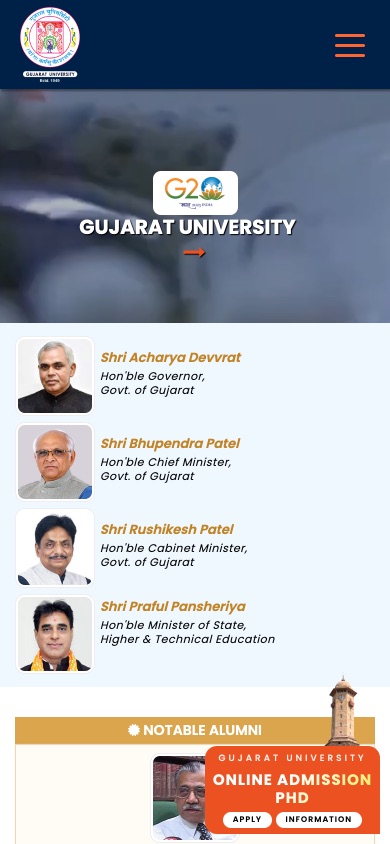
On a phone, the 2024 site opened on a video and four ministers, with a PhD promo floating over the content. The redesign opens on the page itself, with sections in a menu.
Mobile, before and after. Before: the archived site at 390 px, December 2024.

The redesign wasn’t built, but I tested the prototype with students.
I gave seven students one journey: find information about a course. Six of them did it easily, without help.
Prototype test
6 of 7 students found course information easily in the prototype.